TL;DR – Yes, this is a blog entry about making buttons. Well, it’s more about how CSS is awesome and there are a lot of design and development solutions that I wish I could get my hands on and re-solve with today’s tools. Also, my first CodePen pen!
Read this instead: And You Thoughts Buttons Were Easy?
The year is 2009. We need buttons. Not just any buttons. Not just plain gray buttons that browsers will render. We need buttons that are pleasantly rounded and inviting. We need buttons that make users want to click them. We want iOS style buttons that look like they’re made from glass or like the actual real-world device we’re simulating.

By Klaus Göttling – Own work, CC BY-SA 3.0, https://commons.wikimedia.org/w/index.php?curid=26833491
Okay, that’s a lotta button. Let’s keep things simple. Let’s talk about plain ol’ text buttons.
Way back now (in 2009) we have to make these buttons using images. Three images. One for the left hand side, one for the right hand side, and one for the middle. But the middle has to be flexible because you have to accommodate an arbitrary amount of text. (I never glommed on to the sliding door way of doing things.)

That would be four containers for each button – HTML divs: left, right, middle (a sliver of repeating image), and a container for them all.
Now we have a button background. We’ll superimpose our HTML text on top of the image.
Cool. But we also want to make our user interface look lively and responsive. Let’s make it do something when the user hovers over it, and make it look pressed when it’s clicked. Of course, it could also be disabled so we’ll need something for that. We’ll change these states either via JavaScript interaction or, better yet, CSS pseudo-classes.
So we need four sets of images for this button for a total of twelve images. If we decide to change the color of the button, we’ll need to replace those images. We’ll use the PNG 32 format for the images because it allows transparency. This way we can have our rounded edges for our pill shaped button and the background of the site will show through like we’d expect. If the web page doesn’t barf or stall, we should be good. We’ll preload the images first to avoid having them stagger one at time into the loading web page.
Oh, but there’s an issue with that. Internet Explorer 6. The bane of our existence. IE6 doesn’t allow an image to have transparency. Not even a PNG. Unless you use a Microsoft filter. There are a lot of special cases in the code for IE6, a dying medium but also a tenacious hanger-on.
Shadows, glows, rounded things, artistic typography. Lots of images, cleverly sliced, and puzzled together.
ENTER FLAT DESIGN
I made a lot of glassy buttons and lots of beveled edges. Just in time for the backlash — the Flat Design, anti-skeuomorphic design wave. And as is always the case, it was an overcorrection, in my opinion. Nearly all visual cues were omitted in rebellion against the over-designed “here’s a UI that is a one-to-one visual representation of everyday items that you’re used to” with bevels, shadows, reflections, backlighting, etc.
A happy medium was reached, eventually. Think Flat Design but with a little depth.

Are the blue icons clickable?
There are still times when I don’t know that something is clickable. Flat design makes things simpler, tightens up a UI, and eliminates visual “noise”. When taken to its logical conclusion it’s nearly impossible to know exactly what is clickable until you hover over it or click on it, keeping in mind that mobile devices — non-mouse-driven devices — don’t have a hover interaction.
Every “What UX patterns are trending in 200x or 201x” article listed flat design.
This made it possible to use font icon libraries like fontawesome. Of course, font icons are on their way out. SVG icons (with inline SVG??) is the trendy way. But let me not get sidetracked.
Let’s fast forward to now. 2018. Here’s how you make a pill shaped button. No JavaScript involved. No button api or component.
CSS
Now it’s 2018, and like Eva Cassidy sang, time is a healer. Time plus a lot of people working hard to make web development coherent.
EDIT: Okay, I got carried away here, partially because I have a thing for nested CSS. And CSS variables.
This Pen has all the CSS you need to display buttons and make them behave like they were raised with manners. They’re using CSS variables for the colors, hinting at the fact that you could design a theme and change that theme globally with a few variables. (I didn’t go full SASS. Not yet.) Maybe a dark theme will be easier on the eyes at night, for example. Or maybe you’re designing a game and hot pink is the user’s favorite color.
The hover::after pseudo-element is showing a tooltip based on the <div>s custom data-tooltip attribute. I don’t know if it’s right, but it’s fun.
FRAMEWORKS
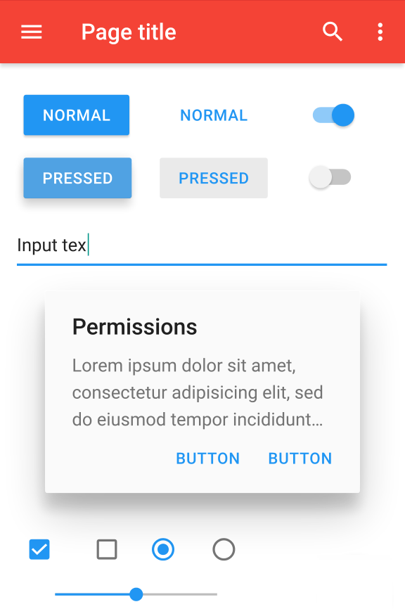
If you want to use a framework, once your environment is set up and files are included or imported, you just give the button a class like “button mdl-button” if you’re using Material Design.
Then you get a button that’s styled, behaves like it’s supposed to, adheres to theme colors, and even animates a little.
We’ve come a long way, baby.
